페이지 정보
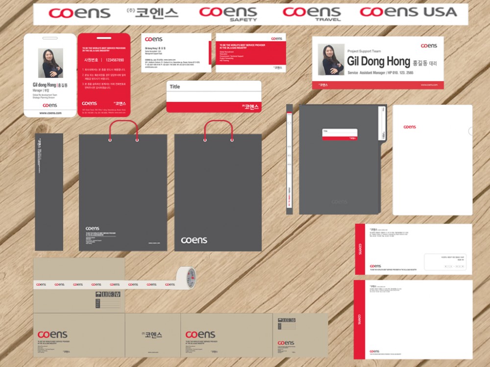
COENS assumes its new corporate identity Posted on 21. Dec. 2021
본문
‘The digital community is active 24/7 and to engage with our stakeholders on the other end of the screen, it is a prerequisite to be on their screen and grab their attention.
Being on their screen will make them aware of our Brand COENS, who we are and what we do.’
And so, with the objective of being on their screen, COENS Energy in its 16th year of successful operation has undergone thoughtful rebranding as COENS.
The rebranding process has not only helped us revitalize our vision, mission and goals, but has also given the momentum to develop strategies for engaging and connecting with existing and potential work partners and thought leaders of the Oil and Gas Industry.
The infinity symbol in our new logo represents the creative maximization of our potential and our endless efforts to provide quality support services to our clients.
In the typography of our new logo, the letters C & O are in red and represent infinite possibility and passion. And the letters ‘ENS’, utilize a deep grey color in order to represent the enthusiastic,
intelligent, and driven people of COENS.
So, if you are on the other end of the screen, then do take a look, get to know us, engage with us and stay connected.
Find us at LinkedIn, Follow us on Twitter, and Join us on Facebook.
- PrevLife in Korea – International Driving Permit 21.12.21
- NextInternational Recruitment Department – Sourcing Ninjas 21.12.21
